Selecting an image format for the Web
Michael Seifert, 2018-11-28Last updated: 2019-01-08
People dealing with Search Engine Optimization will know that the performance of a website affects the ranking of Google search results since 2010. Back then, the Desktop version of a website was used to assess performance. Since mid-2018 mobile website performance is used as a ranking factor for searches.
There are numerous examples of how a fast loading page positively affects the user experience on a website. A case study by Mozilla found that a more performant landing page for the Firefox browser led to a significantly increased number of downloads. Google found that higher loading times increase the probability that a user leaves the website. If you run an online shop, for example, less visitors directly translate to a loss in revenue.
Even though many page speed case studies are somewhat dated, the W3C recently (2018-09) assembled the Web Performance Working Group. The purpose of the WPWG is to establish standardized interfaces for measuring website performance. This development shows that web application performance is still in flux and a highly relevant topic.
The impact of images on performance
The page loading performance is influenced by a number of parameters. Some of these factors are in control of the developer, such as the configuration of the web server or the total amount of bytes that need to be transmitted. Other factors are out of the developer's control, such as network latency. The amount of bytes that need to be transferred for a web application is often referred to as the page weight. The HTTP archive continuously analyses websites and provides recent data about the page weight by content type. The following graphic shows the page weight distribution on 2018-08-15:

Clearly, image content and JavaScript account for most of the page weight of an average website. Therefore, developers can get out the most by optimizing these two content types.
Choosing the right image format
The image format determines the set of available features such as whether transparency is available or not. Moreover, the format choice significantly impacts the final quality-to-size ratio of an image.
We will distinguish between the two main types of image formats: Vector formats and raster formats. As a reminder, Vector image formats use shapes and curves to describe image content, whereas Raster image formats partition the images in a grid of pixels, each of which contains the color information at the respective grid position. While there are multiple raster formats to choose from, support for vector formats on the web is basically limited to Scalable Vector Graphics. On the upside, SVG is supported by virtually all browsers, whereas many raster formats are only supported by specific browser vendors.

SVG images are generally superior to raster formats in web applications. They can be scaled without quality loss1 which allows a single image to be rendered perfectly on different display resolutions. Since SVG images are described by primitive shapes and mathematical curves they are well suited for artificial and abstract content such as logos or info graphics. SVG also allows to leverage the computer as a medium as it provides support for animated or even interactive content. Use SVG whenever possible.
Sometimes it is not possible to use SVG, for example, if the tools do not support vector formats or if the design team simply delivered all assets in raster formats. The first raster format of this overview will be Portable Network Graphics (PNG). PNG is raster image format that provides optional alpha transparency, uses a lossless compression algorithm, and is supported by basically all browsers. What makes PNG special is its support for a color palette. The color palette is used to map a pixel index to the pixel's color. Therefore, PNG is very well suited for imagery with a limited number of colors.2
If your image contains photographic content JPEG is a safe choice since it is supported by all browsers. However, unlike other formats it does not support alpha channel transparency. Unlike PNG, it uses a lossy compression algorithm, but does not compress not as well as many other formats.
JPEG XR supports alpha transparency and generally performs better than JPEG.3 It is currently supported by Internet Explorer and Internet Explorer mobile, as well as Edge. I want to point out, though, that JPEG XR has its own quirks and its use needs to be evaluated carefully.4 JPEG XR also provides a lossless mode of operation. Note, however, that lossless image compression is generally outperformed by lossy compression algorithms. The lossless operation modes of JPEG XR and the following image formats will therefore be ignored for the rest of this article.
JPEG 2000 is performing even better than JPEG XR5, but is only available for Safari and Safari for iOS.
The WebP image format consistently outperforms JPEG across all quality levels.
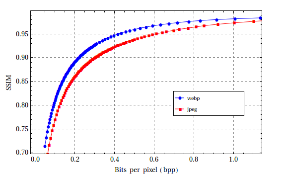
It produces images that are roughly 30% smaller than the corresponding JPEG image. WebP is supported by Chrome, Opera and their mobile counterparts. After Microsoft landed support for WebP in Edge 18, Mozilla has included support for WebP starting with Firefox 65. Browser support therefore looks very good across all major browsers, except for Safari.
As you can see, JPEG images are outperformed by most other presented formats. Ideally, one would use WebP as a raster format for all clients. Due to limited browser support this may not be an option, though. In order to decrease image size as far as possible, we have to deliver the best image format for the respective browser. This means we make the image available in multiple formats and let the browser decide which version to display. We can leverage the <picture> HTML element for this:
<picture>
  <source srcset="image.webp" type="image/webp">
  <source srcset="image.jp2" type="image/jp2">
  <img src="image.jpeg" type="image/jpeg">
</picture>
Each source element specifies a different image format to be displayed. Browsers that support the picture element will choose the most appropriate format available. That means if you visit the page using Chrome, it will load the WebP version, whereas a Safari client will load the JPEG 2000 version. If none of the formats in the source elements are supported, the browser will load the image referenced by the img tag as a fallback. Browsers that do not support the picture element, such as the Internet Explorer6 or Opera Mini7, will also load the fallback image. If you desperately need support for these browsers it is possible to use a polyfill.
Exactly which image formats should be used on a website depends on the specific requirements. However, serving the optimal image format to a subset of visitors will reduce page weight. This, in turn, will be reflected in lower costs for network traffic and faster loading times. Ultimately, this leads to more visitors and visitors staying longer on your website.
The Ameto team is planning to extend the number of supported output formats in early 2019. This will provide users with even more flexibility for creating high-performing media-heavy applications. If you would like to keep updated, feel free to subscribe to the Ameto newsletter.